NOMM
TAIWANESE RESTAURANT
Taiwanese Restaurant
nomm is a Taiwanese restaurant that serves authentic Taiwanese street food for those who miss their home cuisine and for others who are interested in learning about the unique culture through food.
This is a very personal project for me because I grew up in Taiwan and moved to the States when I was eight. Food is an essential part of my culture and a way for me to stay connected to it while being halfway across the world.
This is a very personal project for me because I grew up in Taiwan and moved to the States when I was eight. Food is an essential part of my culture and a way for me to stay connected to it while being halfway across the world.
What's it gonna be?
I started this project with many name ideas, and in the end, I was debating between Lobento and nomm.
Lobento is how you would say street food in Taiwanese Hokkien, a language commonly spoken in Taiwan alongside Mandarin. The word bento is also in the name, which many people recognize as a takeout food box. I initially liked this idea, but the challenge was that most people in the U.S. would associate bento with Japanese culture. This was the main reason I ultimately decided against that name.
In the end, I chose nomm because it rolls off the tongue easily, and the letterforms in both English and Chinese are visually inviting.
Logo Fusion
There were quite a few challenges when I tried to combine the two logos, as they tended to compete with each other. I attempted to simplify 嚼 by using only the top part, but this lost the meaning of the character and even made it unrecognizable; Although it looked like a cute face. The rectangle on the left represents "mouth", which I felt was essential to keep in the design to retain the character's full meaning.
Another challenge was that people in the U.S., including Taiwanese Americans, may not understand Chinese characters. Because of this, rather than using 嚼 as the main logo, I decided to create a logotype for the primary logo, and use 嚼 as a secondary mark.
The Identity
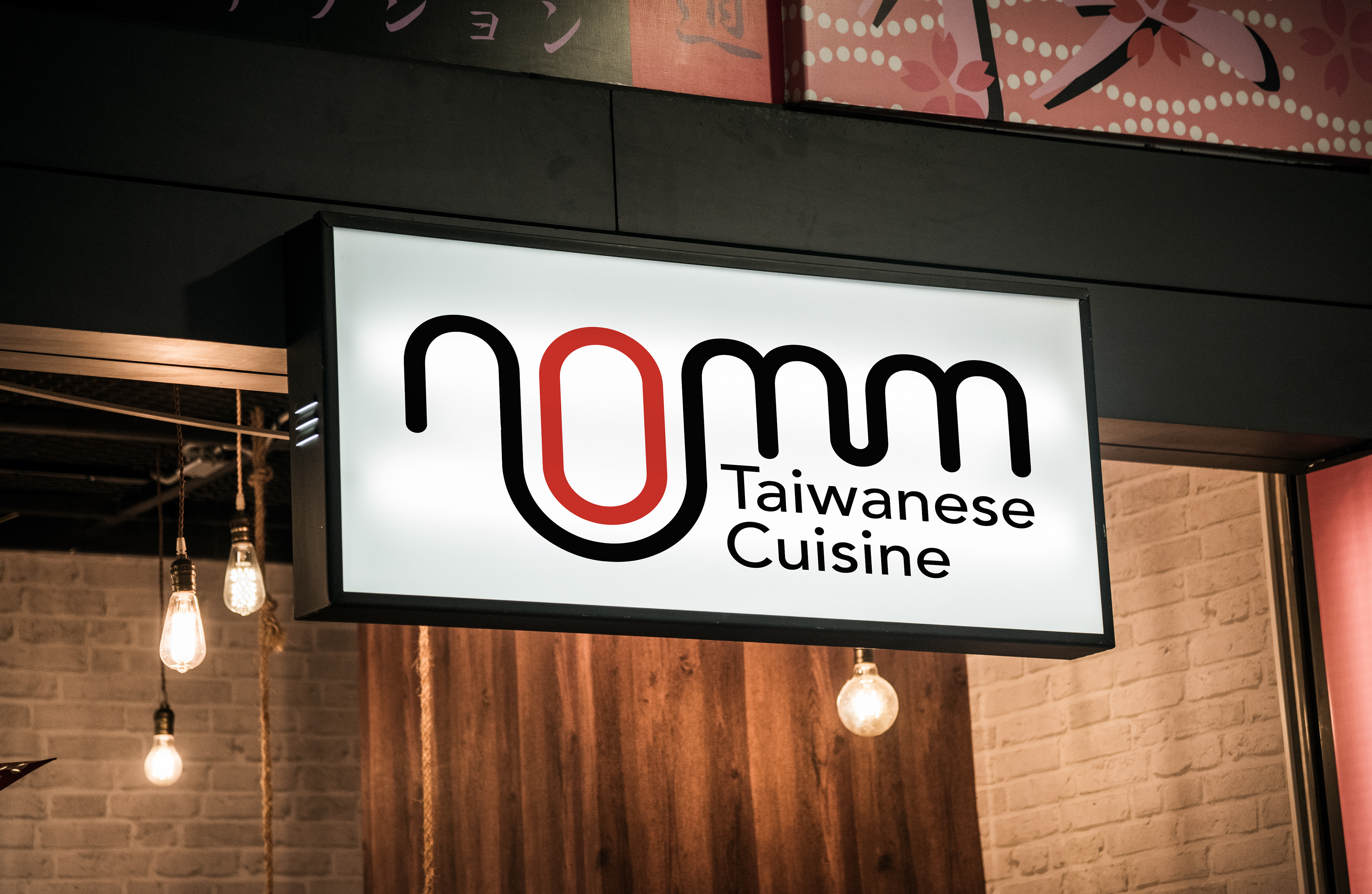
The primary logo features a smooth transition of letters, representing a long strand of noodles to symbolize longevity for the business. The secondary mark is the Chinese character 嚼, which translates to “to chew.” The left side of 嚼 contains the character for "mouth" (口), which shares the same shape as the "o" in nomm, symbolizing a person opening their mouth for tasty food.
Typeface
Avenir, designed by Adrian Frutiger, is used as the primary typeface due to its roundness, like the noodles in beef noodle soup. Chinese characters, like the Latin alphabet, also have characters with “serifs” and those without. A sans serif typeface is used for both the logotype and the Chinese characters to symbolize authentic Taiwanese street food with a modern twist.
Color
Red is associated with appetite and even stimulates it. If you walk down the streets of Taiwan, you’ll see many signs featuring thick red characters welcoming you to their food stalls. Not only is it an appetizing color, but it also catches people’s eyes as they ride their scooters down the street.
Pattern
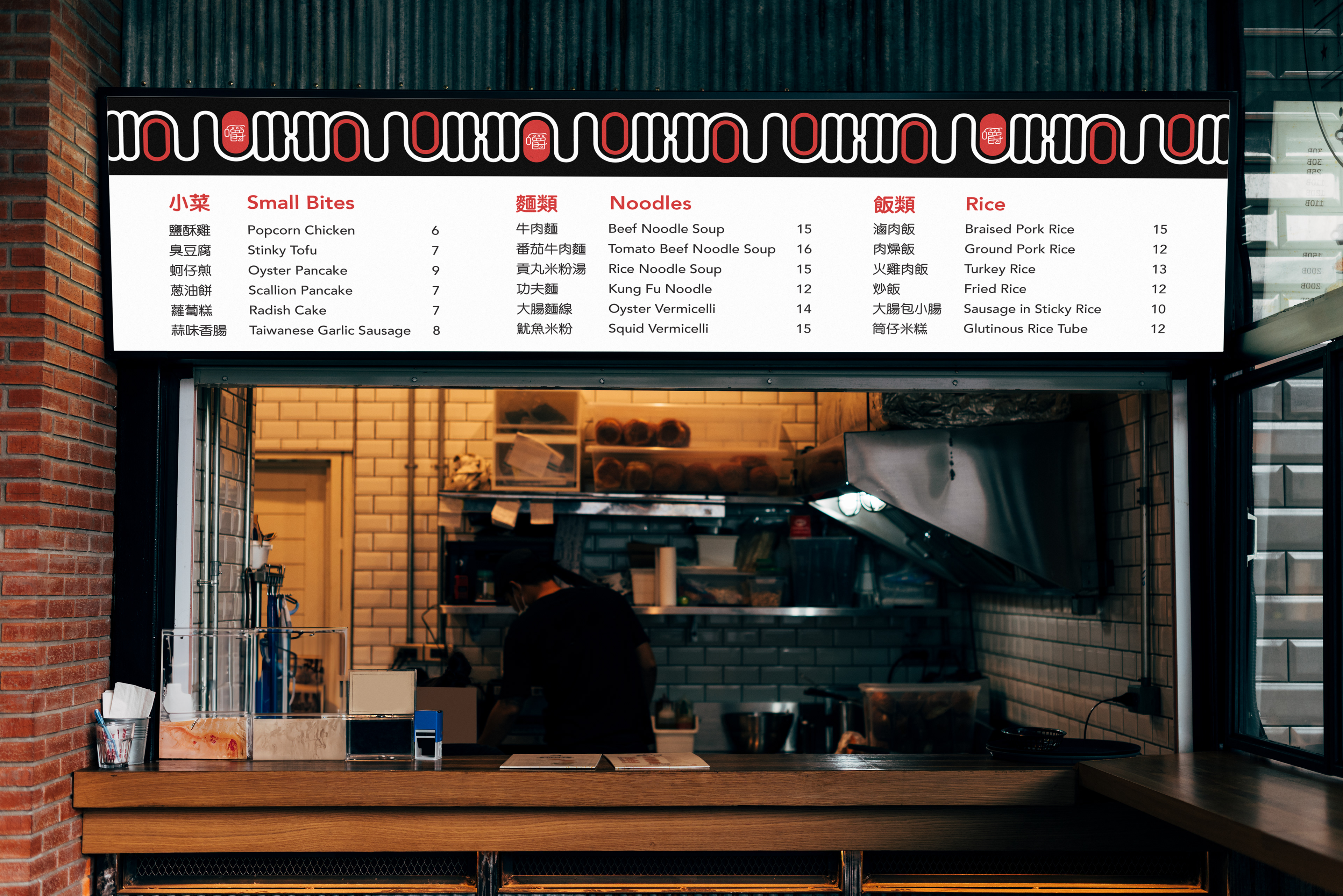
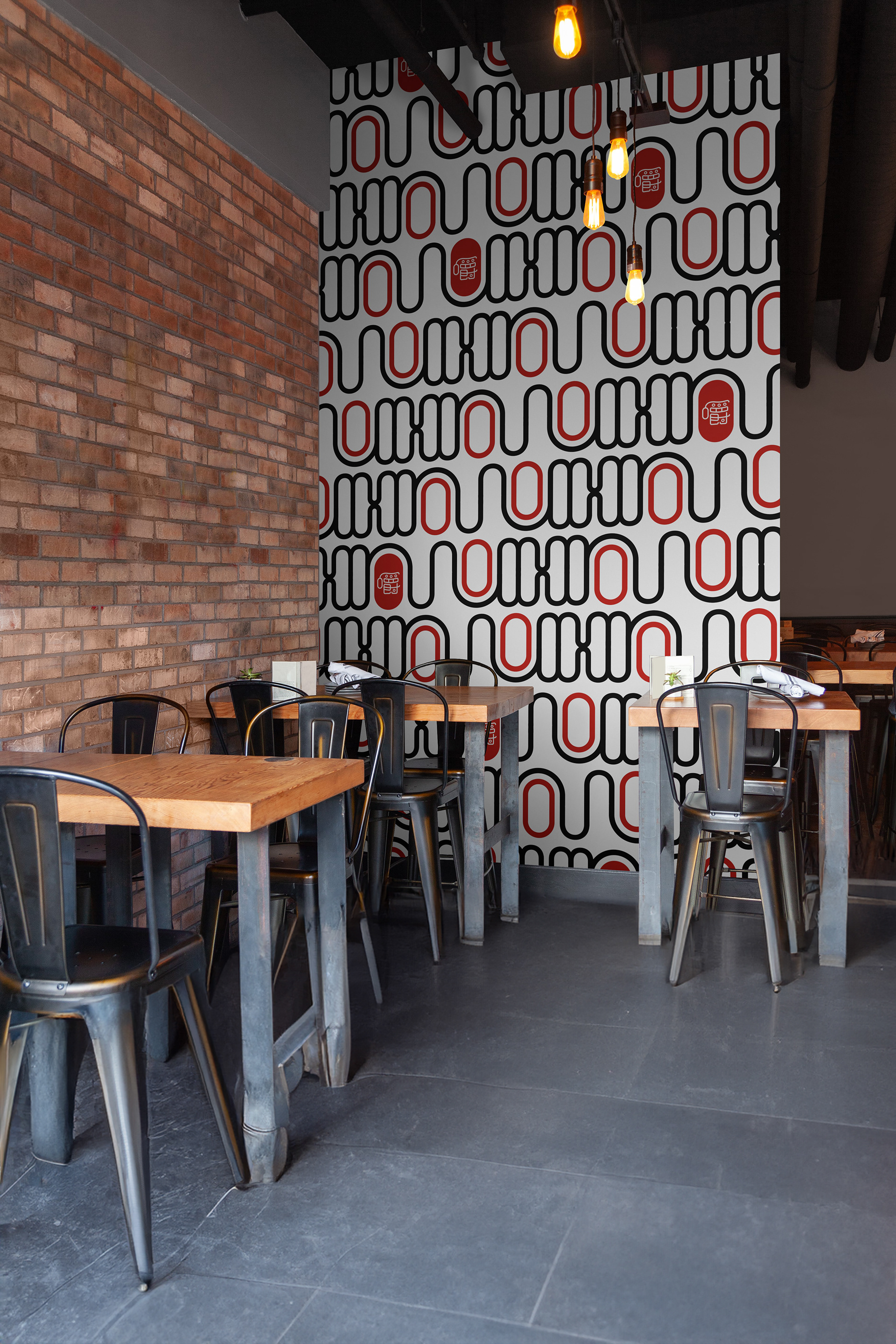
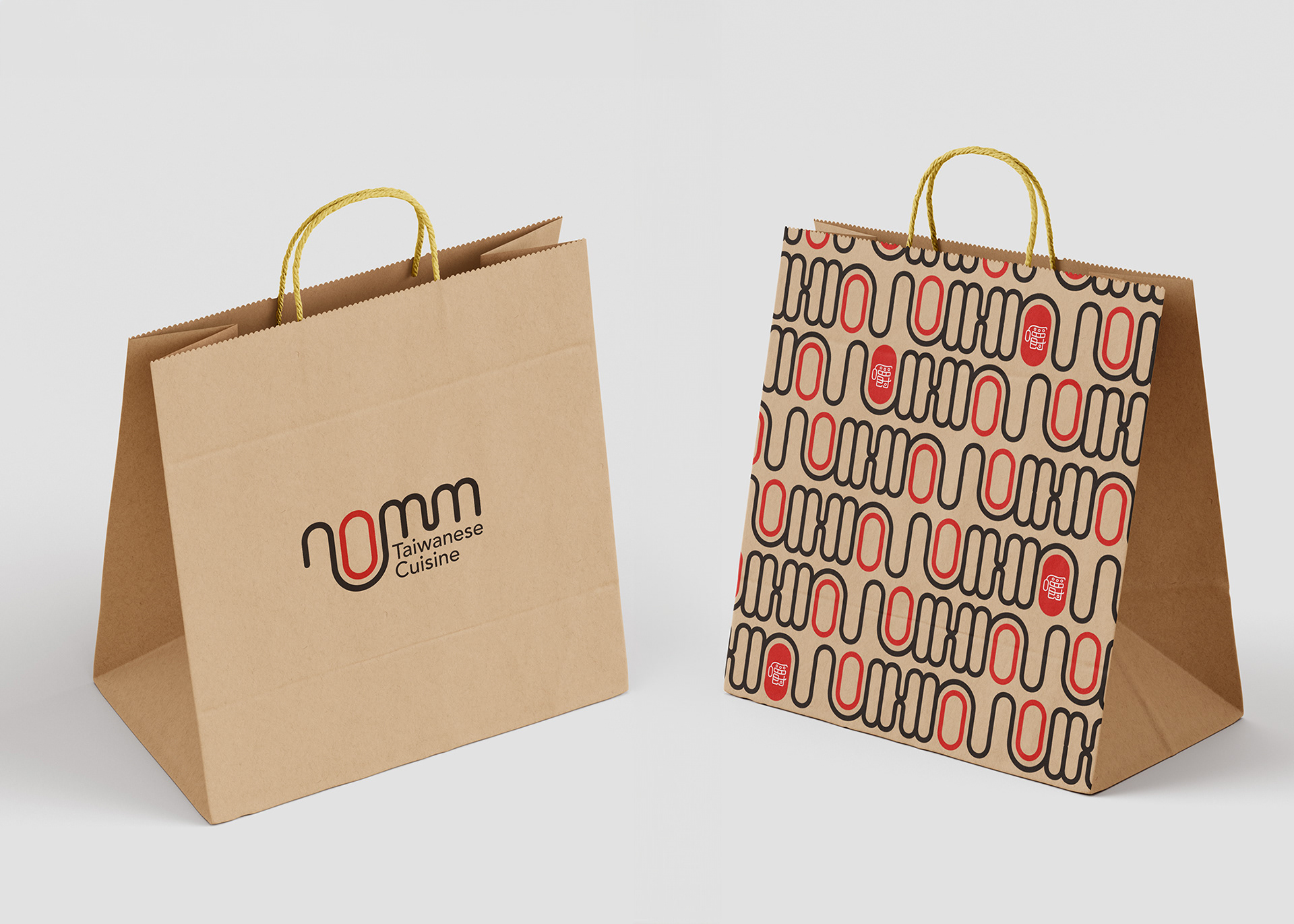
The pattern combines the primary and secondary marks, symbolizing the fusion of Taiwanese cuisine in America. The red “O” appearing in various places represents the foodies with their mouths wide open, ready to enjoy the delicious food.
Atmosphere
The restaurant will have a cozy, welcoming atmosphere that makes guests feel right at home. When they’re ready to order their food, guests will approach the counter, similar to ordering from a street food vendor. After placing their order, they can pick it up at the counter and are welcome to enjoy their meal in the restaurant.


