APINCH
BRANDING|PACKAGING
aPinch is all you need
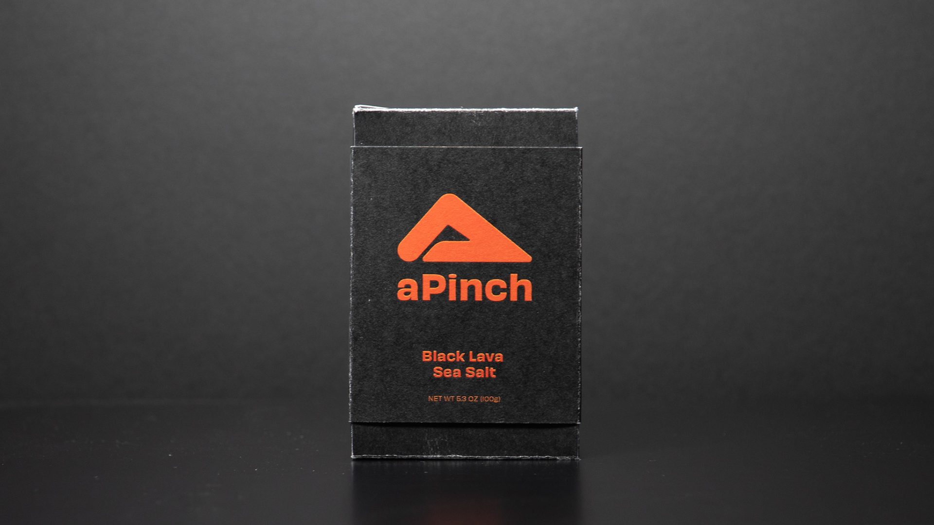
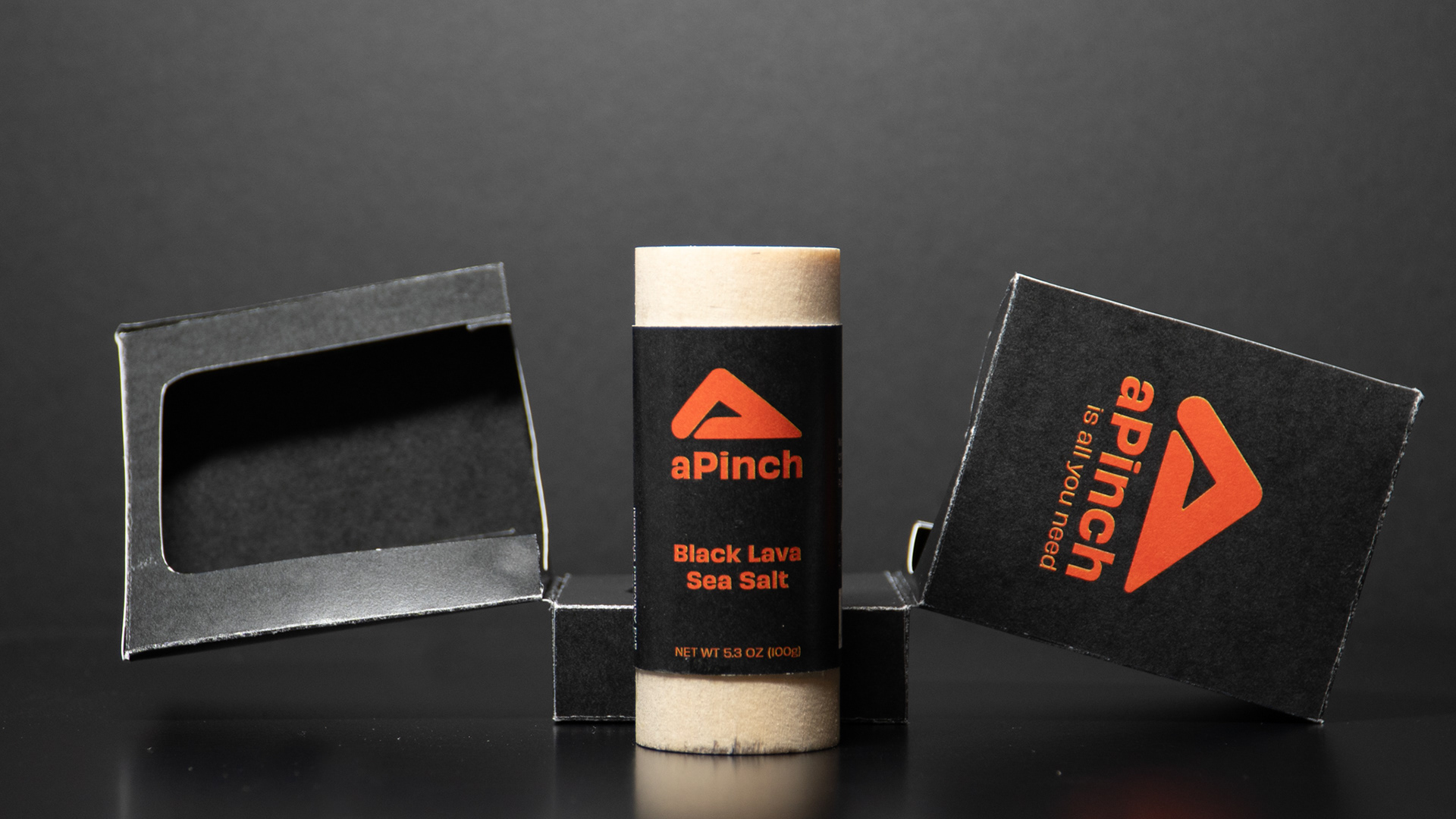
A pinch of salt is a common phrase when instructing people to season their food, and often it's all you need to elevate a dish from mediocre shrimp to something that keeps you coming back for more. With unique packaging that opens like a surprise box, it provides an experience like no other, just like the salt itself.
A Dowel?
A 1.25" x 3" dowel was given to me, and I was tasked with developing a product, branding, and packaging for it. I decided on a salt bottle because it can range from being super cheap to absurdly expensive. In the end, I chose the high end route, as it often allows for more unique packaging structures.
Logo
The logo features a hand pinching salt, and the triangular shape represents how salt naturally forms when sprinkled in a pile. The angularity in the initial designs felt too harsh and lacked the softness of a human hand. I also experimented with adding curves to some of the lines, but it felt inconsistent when not applied to all sides of the triangle. Ultimately, the final logo uses straight lines with rounded corners to convey a humanistic feel while maintaining consistency.
Typeface
I wanted the typeface to convey a slight pinching feel, which is why Obviously by James Edmondson (one of my favorite typeface designers) was the perfect choice for aPinch. Its subtle humanistic quality enhances the overall aesthetic of the product, making it feel more handcrafted.
Colors
Each product has its unique color palette, with a darker background with a pop of color. The color choice reflects the taste and feeling it shows while enhancing the dish.
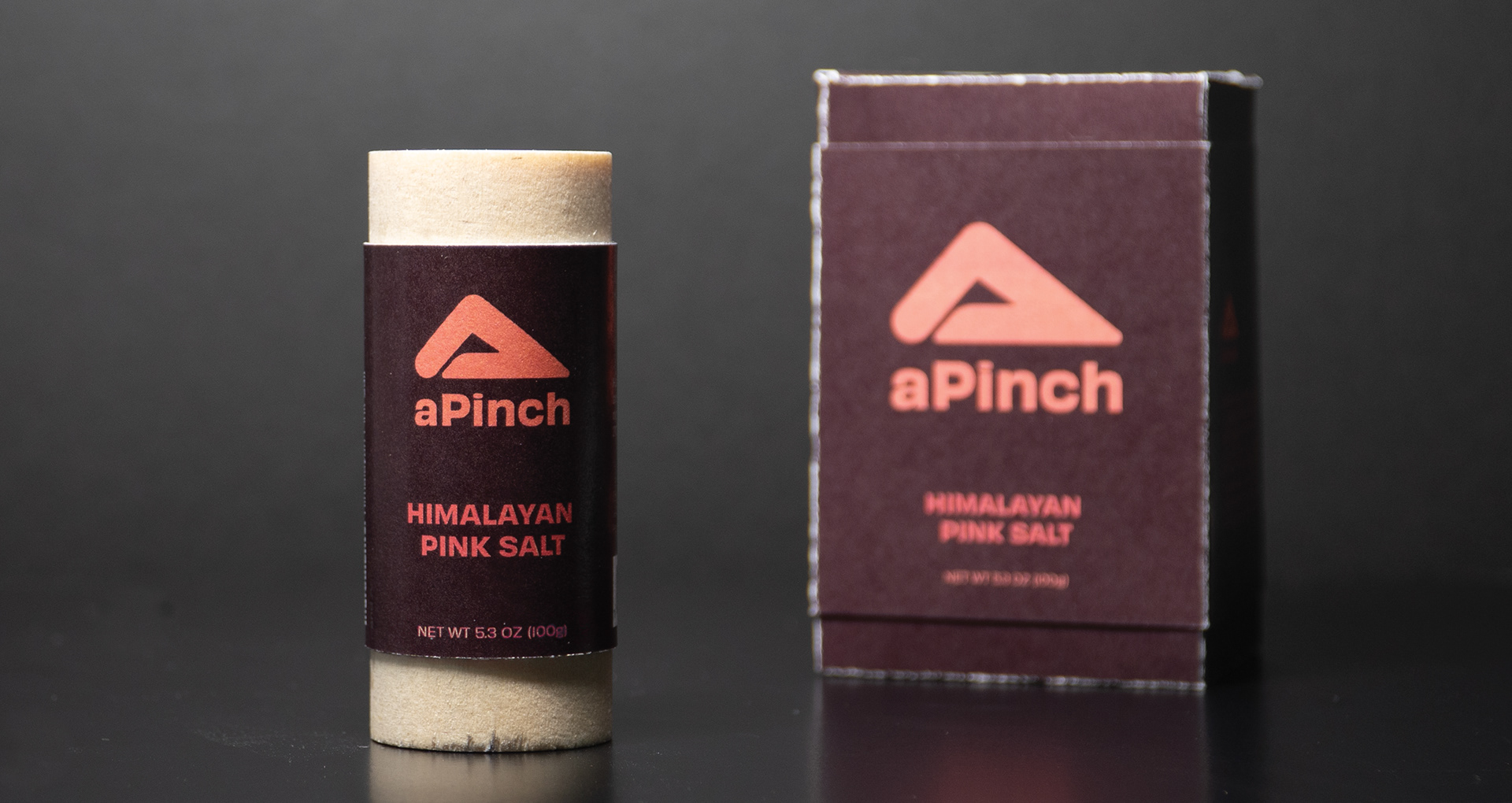
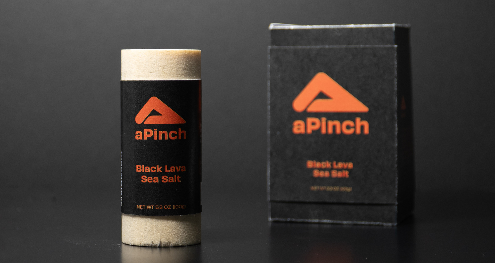
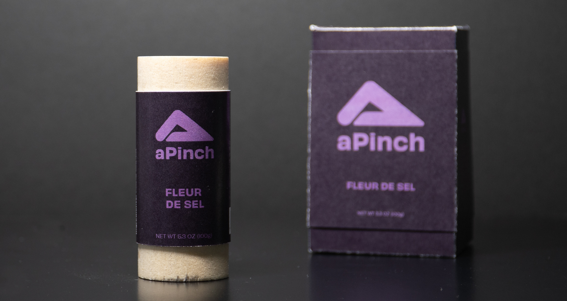
Branding
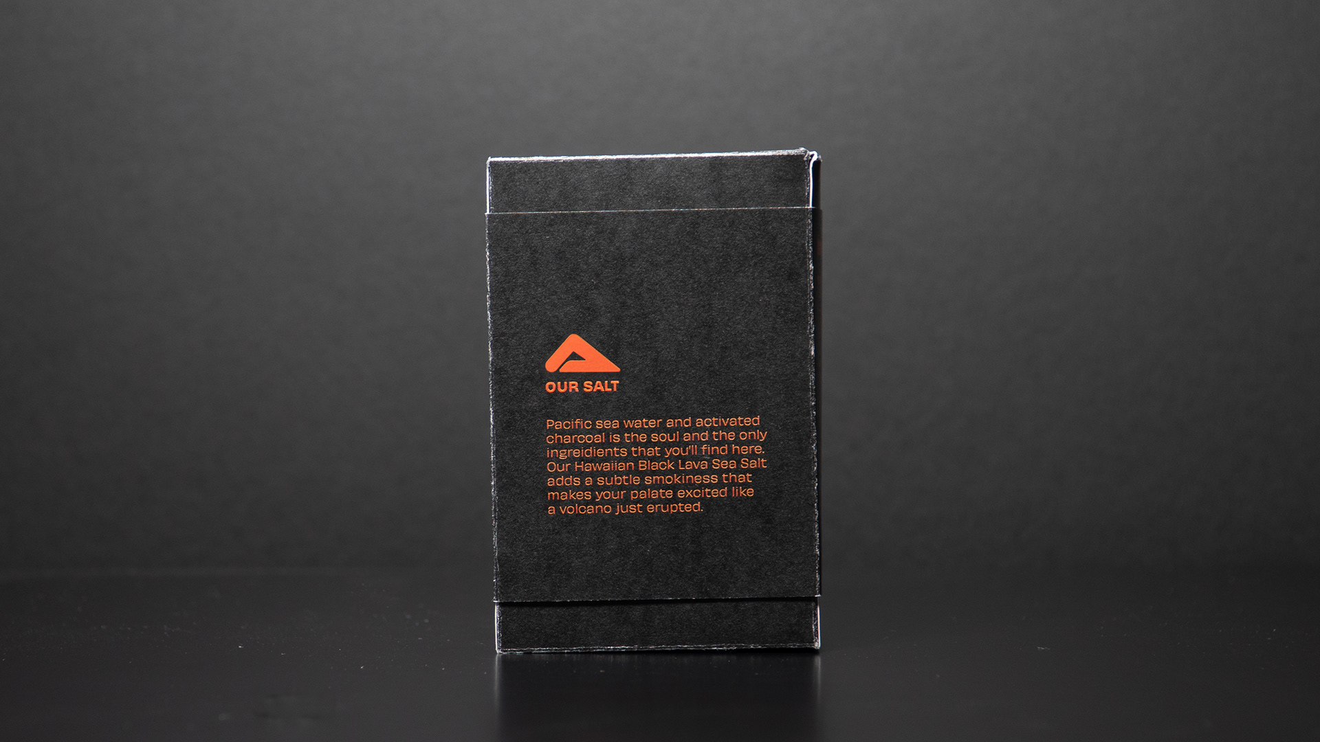
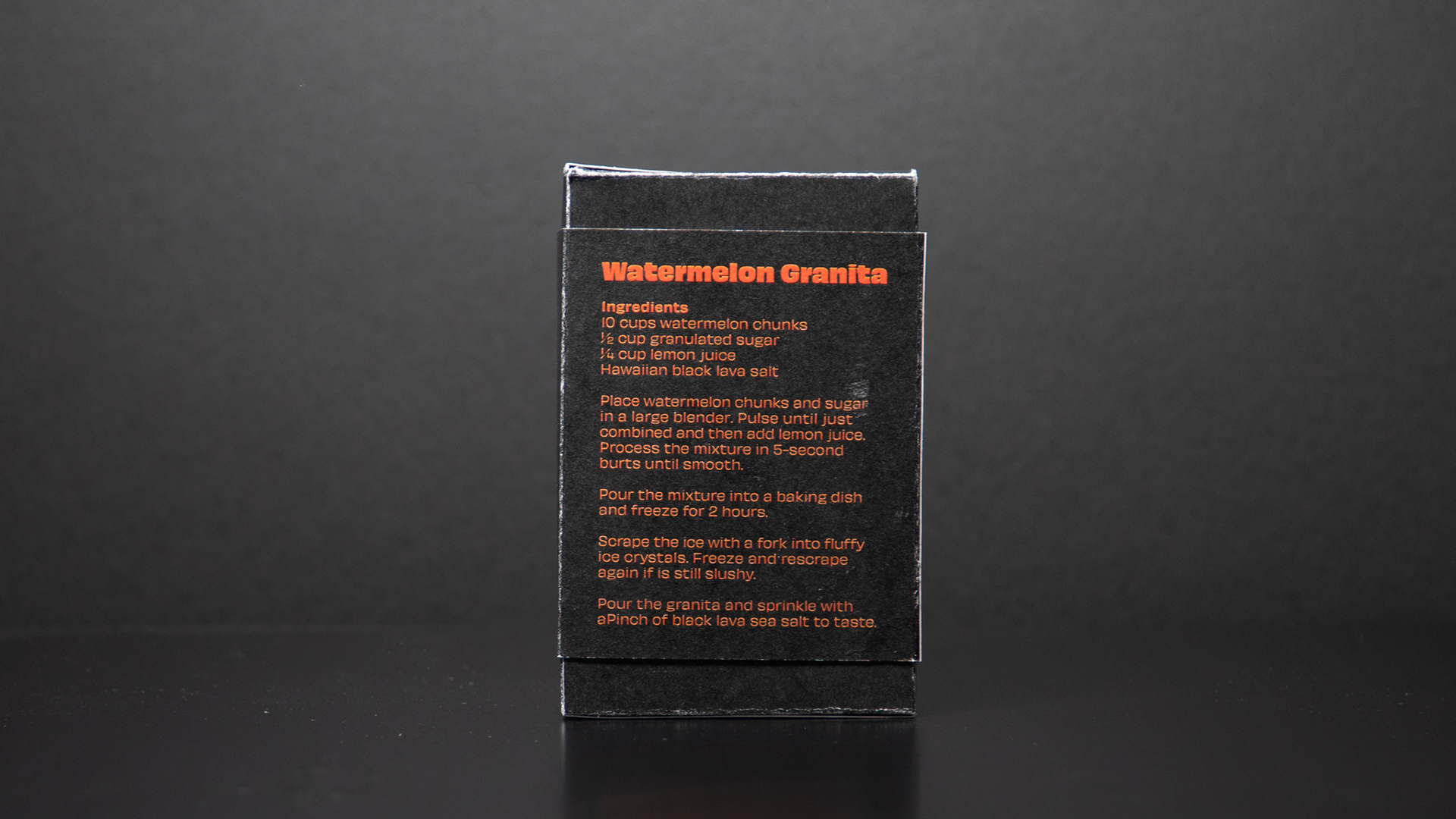
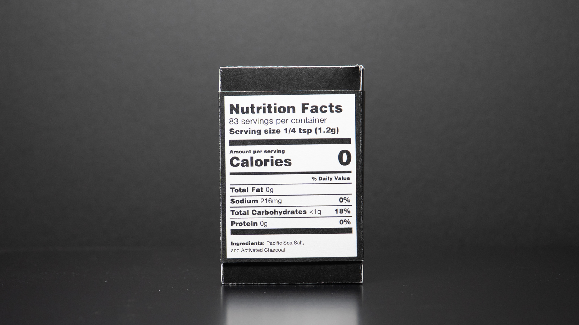
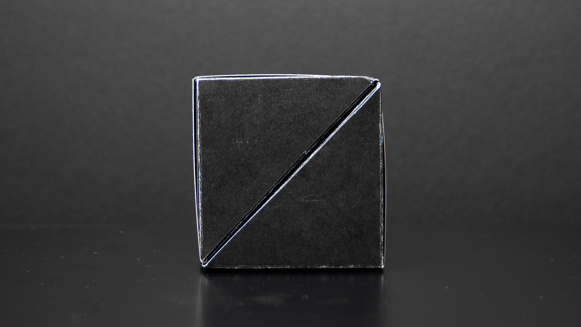
The branding is simple, much like how salt complements food. The colors not only evoke the essence of the salt but also make it easier for consumers to quickly identify the correct box. Initially, the idea was to hide a pattern behind the sleeve, but that would have been a production nightmare. The final solution was to create a sleek box that highlights the engineering of the opening mechanism.
Structure
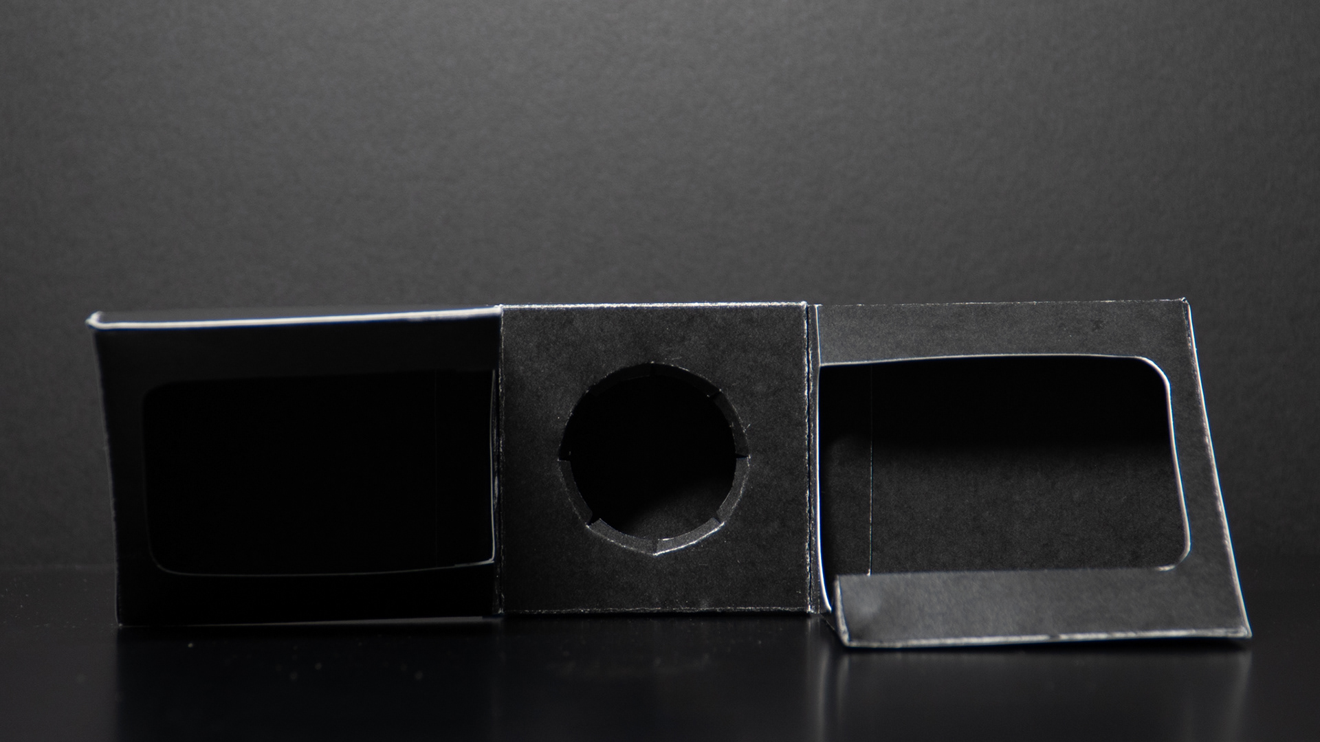
The unboxing experience was one of the main focuses of this project. When people buy expensive products, the unboxing is a key part of the overall experience. If they’re paying a lot of money, struggling to open a box is the last thing they want. As they hold the product in their hand and slide off the sleeve, the packaging pops open to reveal the salt!
The biggest challenge was working with the dimensions, as the design had to fit on a 12" x 18" paperboard. I had to strike the perfect balance between structural integrity and meeting the size requirement. This made it particularly hard as the inside of the cutout would scratch against the dowel in the beginning stages. I had to keep widening the inner cutout in order to prevent this from happening.
The structure of the packaging was inspired by Noreste Studio's Abracadabra perfume. The die-line was created in ArtiosCAD.
